Choropleth Map
-A map that uses graded differences in shading
or color or the placing of symbols inside defined areas on the map in order to
indicate the average values of some property or quantity in those areas.

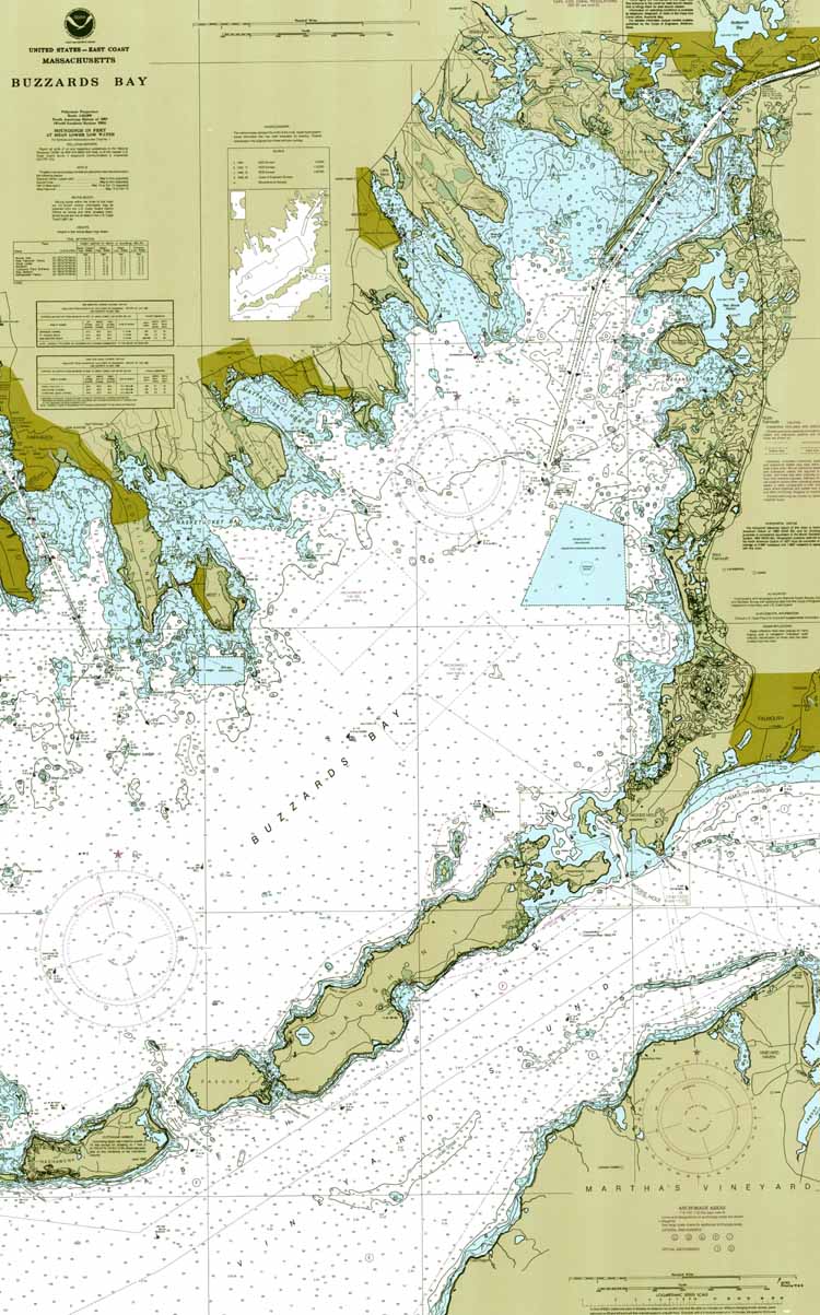
Nautical Map
-A nautical chart represents part of the
spherical earth on a plane surface. It shows water depth, the shoreline of
adjacent land, prominent topographic features, aids to navigation, and other
navigational information.
http://buzzardsbay.org/nautical.htm
Thematic
Map
-A thematic map displays spatial pattern of a
theme or series of attributes.

Topographic Map
-Topographic maps usually show a geographic
graticule and a coordinate grid, so you can determine relative and absolute
positions of mapped features.

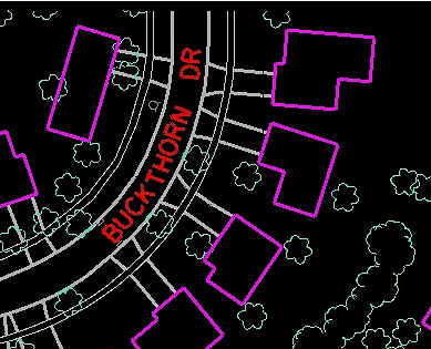
Cadastral Map
-A legal map for recording ownership of
property. The map describes both the boundaries and the ownership of properties.

Isoline Map
-A line on a
map or chart along which there is a constant value (as of temperature or
rainfall).

PLSS Map
-PLSS is public land survey system and is
used, like this one, to show land parcels.

Flow Map
-This is a
PLSS map, and displays township range and sections for Oklahoma. PLSS is public
land survey system and is used, like this one, to show land parcels.

Propaganda Map
-These maps favor graphic symbols that are
embedded with meaning.

Hypsometric Map
-Map of topography involving a color sequence filling
the spaces between successive contours, usually varying from green through
yellow to brown.

Planimetric Map
-A planimetric map is similar to a topographic
map, in that it depicts features of the Earth's surface including geographic
objects, natural and cultural features, and other entities. The difference, is
that planimetric maps only display horizontal features, leaving out elevation
and relief of things.
Mental Map
-Refer to a person's point-of-view perception
of their area of interaction.

Dot distribution Map
-Is as a map type that uses a dot symbol to show the presence of a feature or phenomenon.
-Is as a map type that uses a dot symbol to show the presence of a feature or phenomenon.

Multivariate Map
-This is also an unclassified choropleth map.
The changing colors represent relationships between plant growth and the
variables being compared. This particular map uses the multivariate clustering
technique.

Proportional circle Map
-Proportional Circle Map - Information is
displayed via the size of the circle.

Cartogram
-This is a cartogram map of the world. It
distorts the countries and continents in order to show the information of the
variables.

Statistical Map
-We take numerical data and represent them in
map form, using color, statistical symbols, and local comparative graphs to
highlight the results.

Black & white aerial photo
-Black and White Aerial Photo - Photo
displaying large tracts of land that was shot by a flying plane.

Infrared aerial photo
-Infrared aerial photos, such as this one, can
be used to display changes in the environments. It is a useful tool in
determining many different aspects of the environment, and this is a high
altitude shot of the environment.

Doppler radar
-Doppler radar maps use radio and micro waves
to determine the distance of certain objects. Typically Doppler radar is used
for weather purposes and in the field of meteorology to map storm patterns and
potential natural disasters.

Light Detection and Ranging (LIDAR)
-LIDAR is a type of remote sensing
technology that uses a laser to scan the earth's surface and pick up both man-made
structures and surface features such as vegetation. LIDAR images are useful as
maps since they show a variety of information.

Box Plot
-A box plot or boxplot is a convenient way of
graphically depicting groups of numerical data through their quartiles.

Histogram
-Area cartograms are maps in which the sizes
of geographic regions such as countries or provinces appear in proportion to
their population or some other demographic feature such as income.

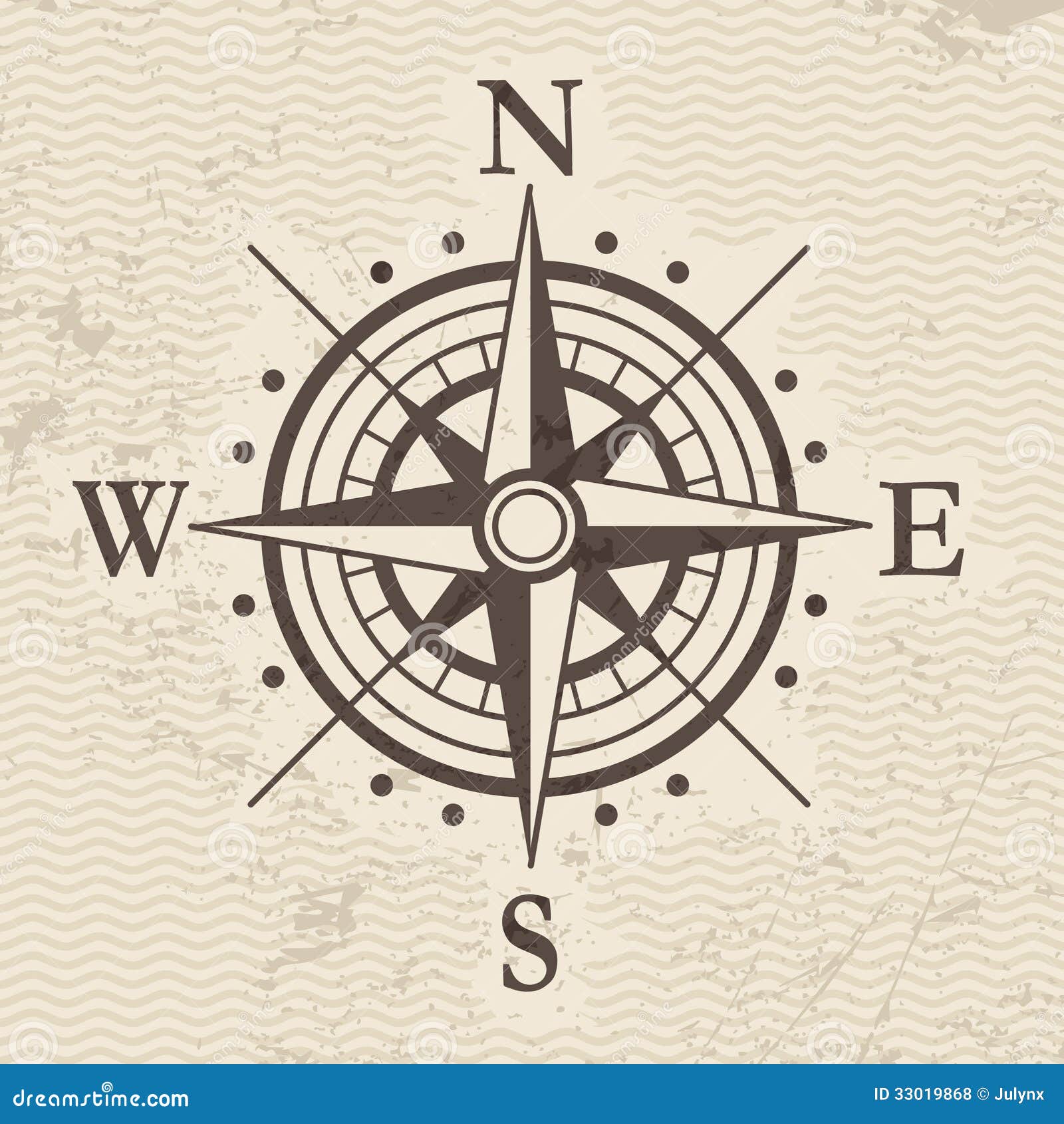
Windrose
-A windrose is a diagram indicating compass
directions on terms of eight principal winds.
Triangular Plot
-A triangular plot is a two-dimensional map in
which three variables are mapped. The ratios of the three variables are plotted
as positions within an equilateral triangle.

Scatterplot
-Scatter plots displays the values of a
dataset on a graph with two axis of variables.

Index value plot
-Index value plots are used to show change in
a variable that is constantly changing. Such values that are commonly graphed
are rainfall, stream flow, and temperature.

Star plots
-Star plots are used to graphically show data with more than one variable. Each star a whole represents a single data set and the points to the stars represent the variables that represent the data set.
-Star plots are used to graphically show data with more than one variable. Each star a whole represents a single data set and the points to the stars represent the variables that represent the data set.

Correlation matrix
-A correlation matrix takes into account several variables in this case 11 and shows how they relate to each other. In cartography correlation matrices can be used to show the relationship between everything from soil to temperature.
-A correlation matrix takes into account several variables in this case 11 and shows how they relate to each other. In cartography correlation matrices can be used to show the relationship between everything from soil to temperature.

Similarity matrix
-Similarity matrix maps show the similarity between two points.
-Similarity matrix maps show the similarity between two points.

Stem and leaf plot
-Stem and leaf plots is a way of presenting
numerical data.

Parallel coordinate graph
-A parallel coordinate graph is a graph that shows information in several dimensions. Each variable is graphed on a vertical axis and each data element is plotted as a connected set of points, one on each axis.
-A parallel coordinate graph is a graph that shows information in several dimensions. Each variable is graphed on a vertical axis and each data element is plotted as a connected set of points, one on each axis.

Population profile

Climograph
-Climograph - combines information about a
locales monthly precipitation and relating temperature conditions.

Digital Ortho Quarter-Quads( DOQQ)
-Digital ortho photo quarter quad or DOQQ is
an aerial photo that is digitally corrected so that the scale is uniform and
has the same lack of distortion as a map. These are like aerial photos with the
distortion removed. DOQQ maps are spatially accurate with different planimetric
features appearing in their true geographic positions on the planet.

Digital raster graphic (DRG)
-Digital Raster Graphic, or in other words, a
scanned and georectified USGS topo quad.
The DRG contains all the same information as the scanned paper map, and
they are widely available for public use.

Digital line graph (DLG)
-Digital Line Graph, is a cartographic feature
that is represented in digital vector form. DLG's contain a wide variety of
information, including topography, hydrography, boundaries, roads, and
contours.

Digital elevation model (DEM)
-DEM is a map that displays elevation data as
either a digital model or 3-D representation of the Earth's surface. The data
is usually collected through the use of remote sensing, with the USGS being a
frequent producer of these maps. Most maps use a color scale to depict
elevation height

Classed choropleth map
-These maps are used to show data through
color shading which is explained in the legend or key to the left hand side of
the map.

Unclassed choropleth map
-This unclassed choropleth map uses data values that are proportional to the shading in the map.
-This unclassed choropleth map uses data values that are proportional to the shading in the map.

Bivariate choropleth map
-Bivariate choropleth map only contains two
variables.

Univariate choropleth map
-This is a univariate choropleth map that
displays a single data set, which in this case is percentage of individuals.
Univariate choropleth mapping uses basic choropleth mapping through shades of
different colors

Isobar
-An isobar is a line drawn on a weather map
connecting areas of equal pressure.

Isotachs
-Isotachs, A contour map that displays and
connects like wind speeds.

Isohyets
-Isohyets, contour map connecting areas of
equal precipitation

Isopach
-Isopach maps are concerned with the soil and
sediments within the soil. Like the other "Isos" isopach maps contain
lines that are connected through sediment thickness. Color are also assigned to
differentiate between different thicknesses.

Isopleth
-Isopleths are maps that connect areas of
equal value and are used to show different facets of those areas in relation to
the rest of the other regions shown.

Lorenz Curve
-Lorenz Curve/Accumulative Line Graph -
demonstrates the income curve of a specific population.

Bilateral Graph
-Bilateral Graph, type of visualization graph
that depicts two relate-able variables.

Range Graded Proportional Circle Map
-Range Graded Proportional Circle Map - data
is divided into groups using classification procedures common to choropleth
mapping. The design goal is for symbol size discrimination, rather than
magnitude estimation.

Continuously Variable Proportional Circle
Map
-Continuously Variable Proportional Circle Map
- map that utilizes circles to create point data. The circles are in proportion to the variable
bring measured.

Cartographic Animation
-Cartographic Animation, Display visual
changes of geospatial data of a specific region.

Treemap
-The Treemap is ideal for displaying large
amounts of hierarchically structured (tree-structured) data.

Combination Chart
-The Combination Chart is a visualization that
combines the features of the line chart and the bar chart.
